Concept · 2023
BarbeQueue
A mobile UX case study for simplifying BBQ food ordering.
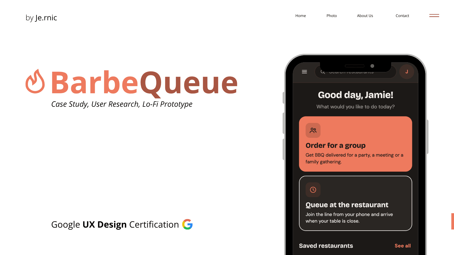
The Challenge
How could we make BBQ ordering seamless from discovery to checkout?
01. Overview
A mobile ordering experience designed for BBQ lovers.
BarbeQueue (pun not intended) was a concept that I thought of when ideating for the Google UX Design Course.
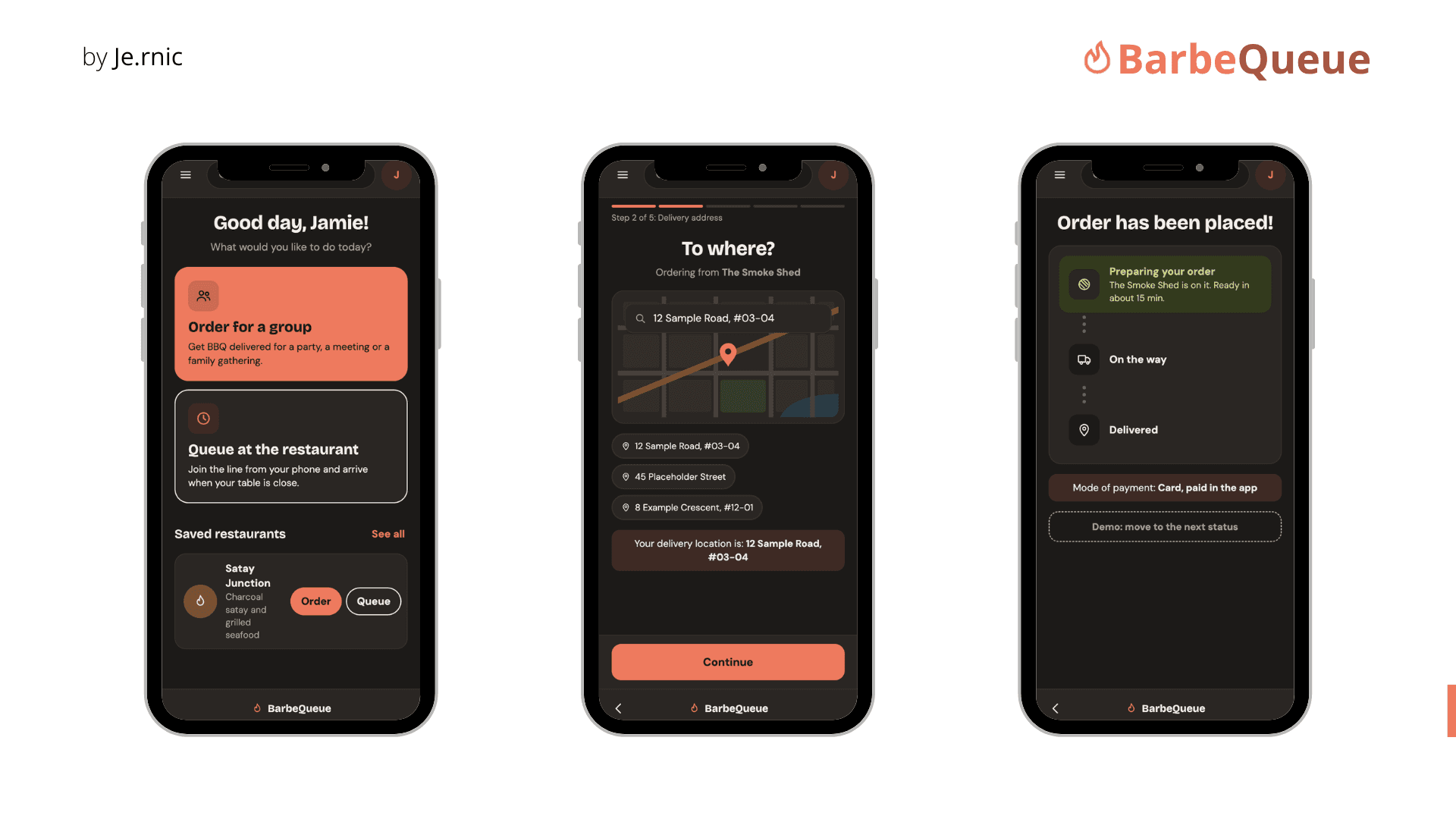
The Goal: To bring BBQ restaurant discovery and ordering all into a single platform.
02. Research approach
User Journey
I started by creating a user research plan centred around the tasks a customer would usually do:
- Choosing a restaurant
- Customising food orders
- Checking out
- Selecting a payment method
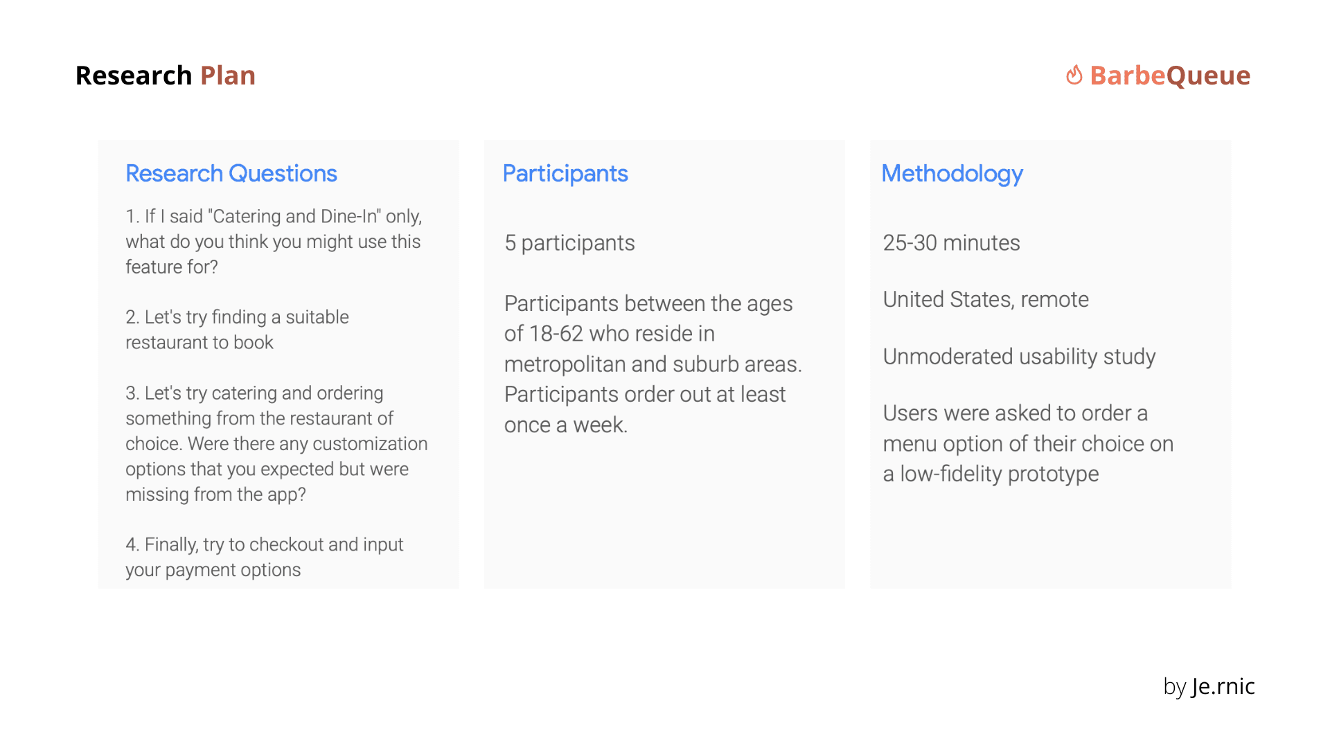
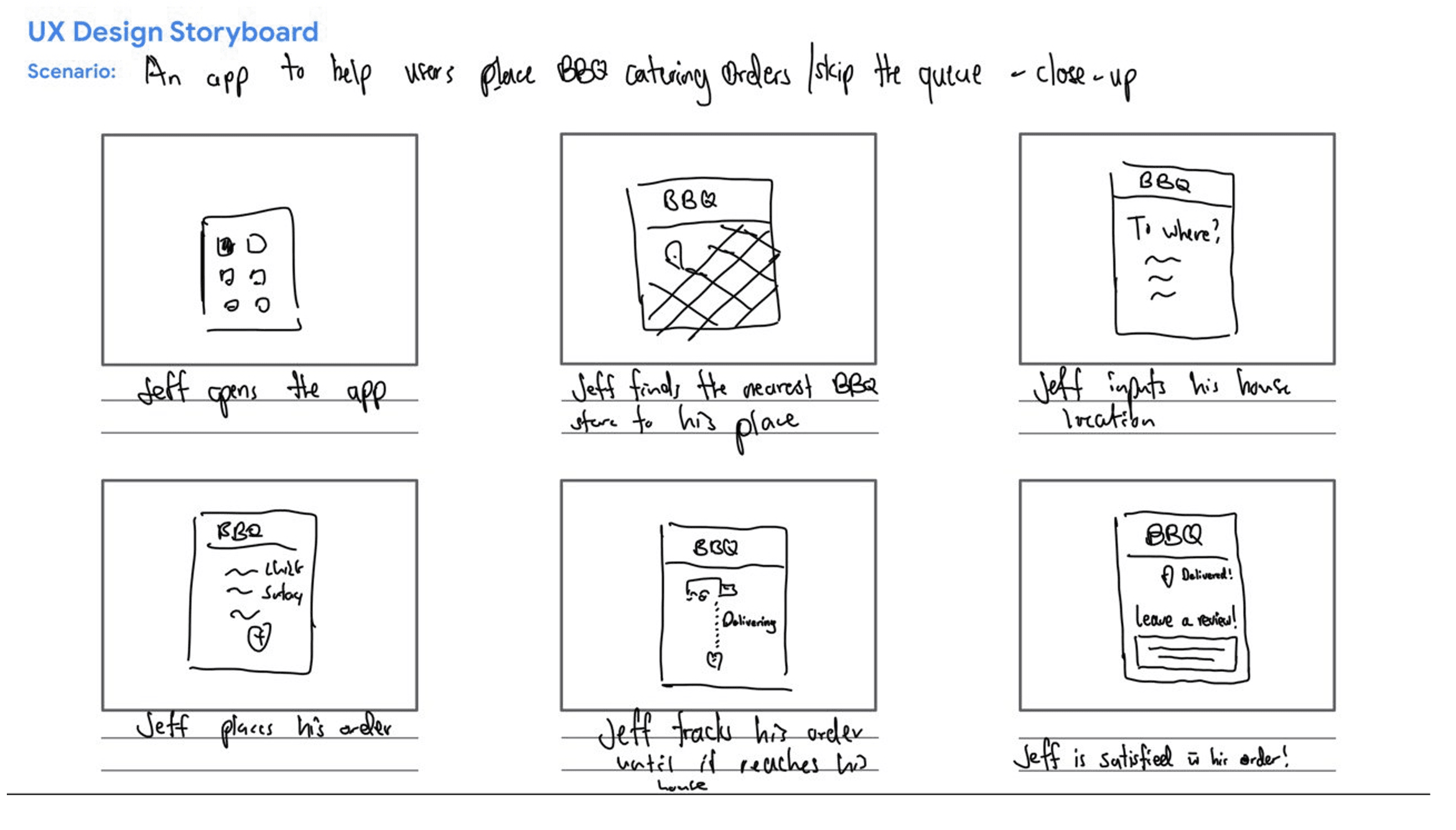
Storyboards helped me think beyond individual screens
Alongside the initial research plan, I mapped a possible customer journey using a persona:
Jeff, a hungry corporate worker wants to dine-in at his favourite BBQ restaurant. Seeing the long queue, he realises ordering through his app instead would allow him to skip waiting for the food given that he has a short lunch break of an hour only every day.
The storyboarding helped frame the app as a complete service for me to build the research around, rather than simply a collection of screens.
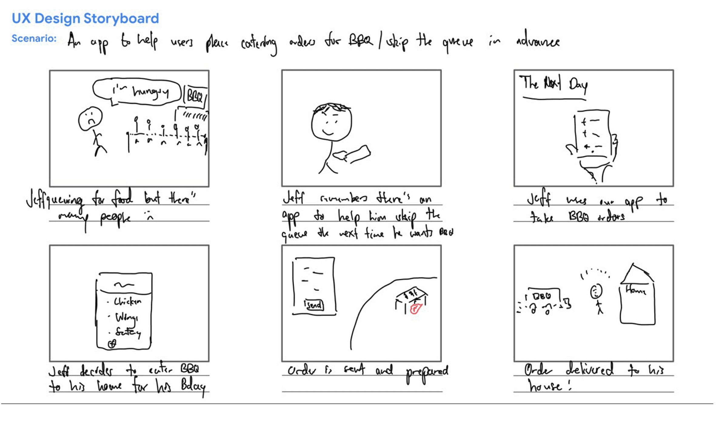
Remote usability study
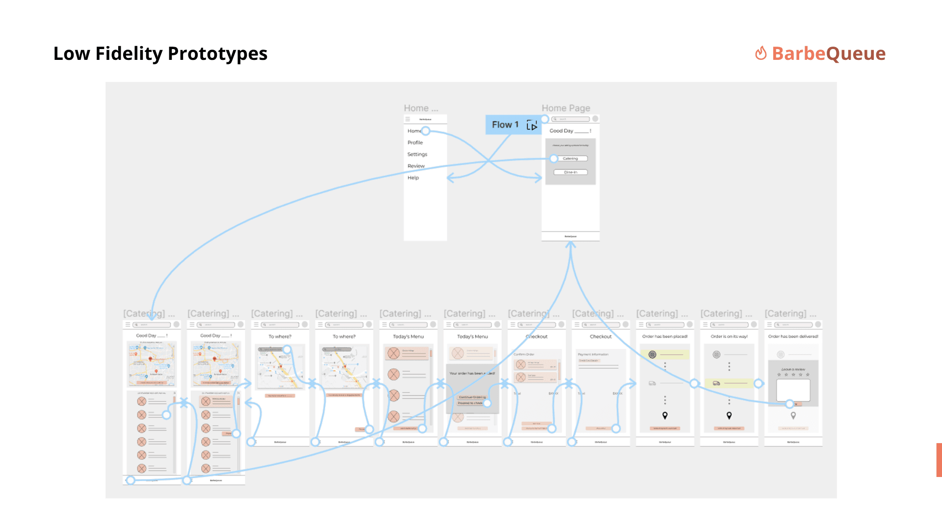
I then crafted out a low-fidelity Figma prototype over the next 1 week for the usability study. Instead of asking users whether they liked the visual interface, I gave them guided tasks to complete so as to observe where the app-flow became unclear for users.
03. Research Insights
Observations
The prototype exposed assumptions within the wireframes. Participants did not always interpret the experience in the way I expected, and that helped paint a different perspective for me. For example:
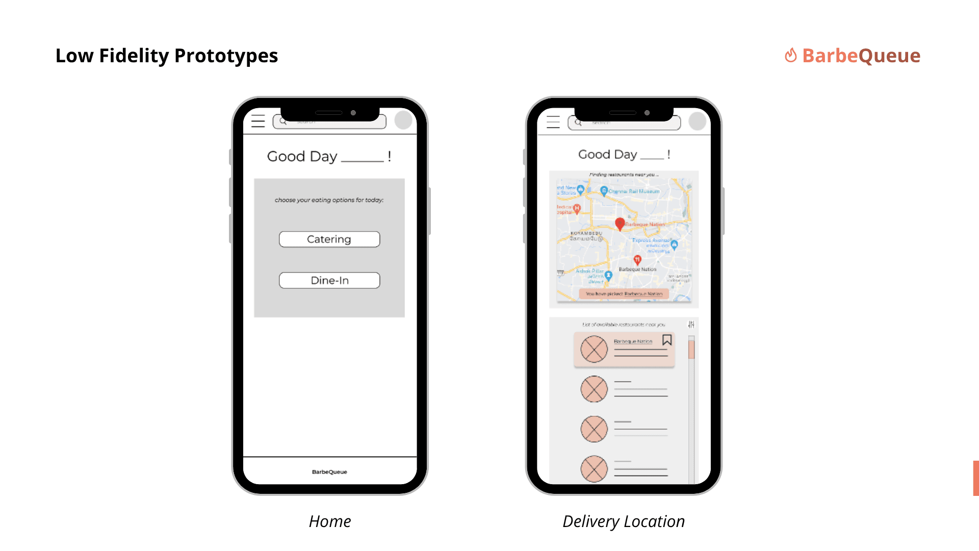
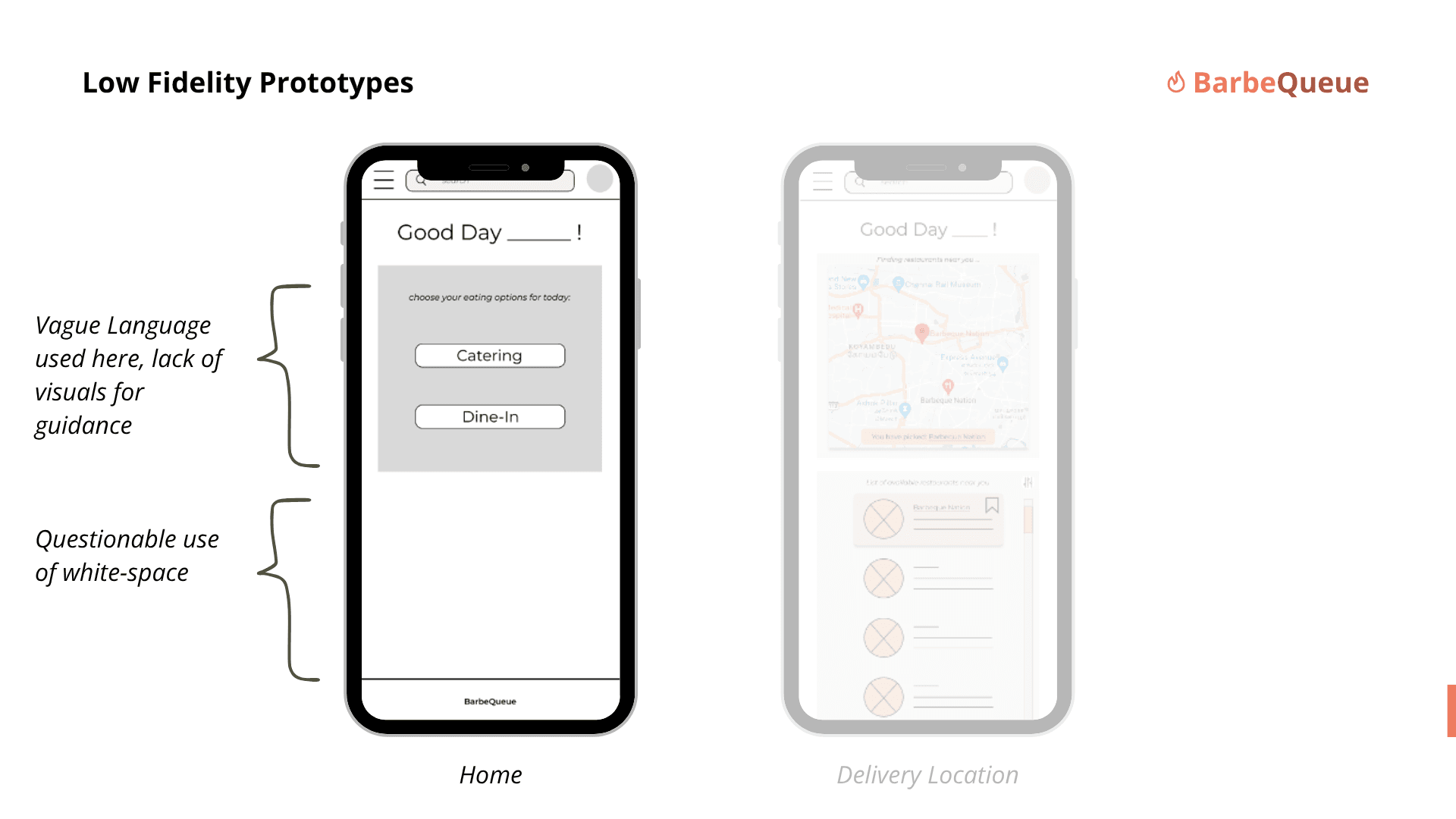
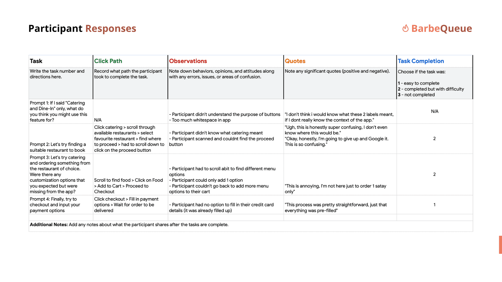
“I don't think I would know what these 2 labels would have meant, if I didn't have any context of the app beforehand.”
What Repeated
I then grouped the observations into three needs that kept recurring:
Order quickly.
5 of 7 participants wanted to order from their chosen restaurant in under five minutes. 4 also wanted to favourite their go-to restaurants.
More customisation.
4 of 7 participants wanted to order more than one menu option, and 3 of them wanted a cart to save their selections.
Payment-on-delivery.
6 of 7 participants wanted cash on delivery, so checkout could not assume that online payment was the only route.
04. Design solutions
Findings -> Redesigns
Three focused design decisions thus translated the findings into a revised ordering experience.
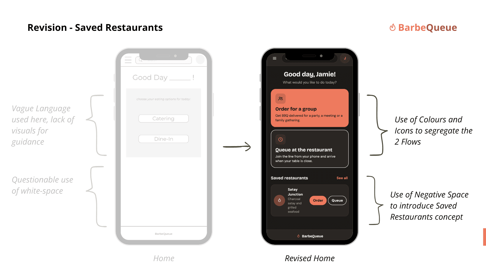
Feature 01
Saved restaurants help repeat customers return to familiar places without starting their search again. I made them accessible from the profile.
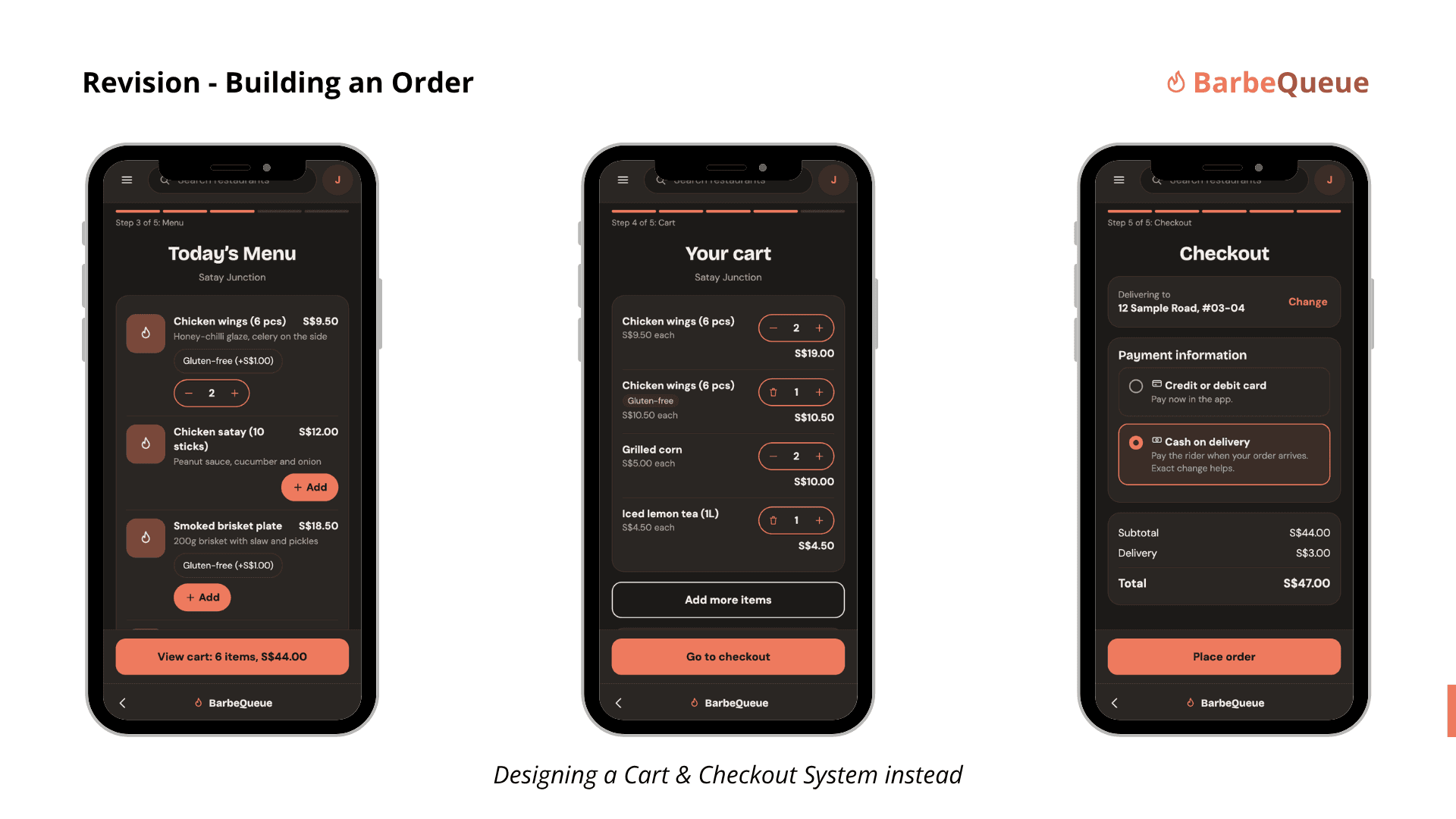
Feature 02
An editable cart lets customers add and review multiple items before checking out, instead of treating each selection as a separate order.
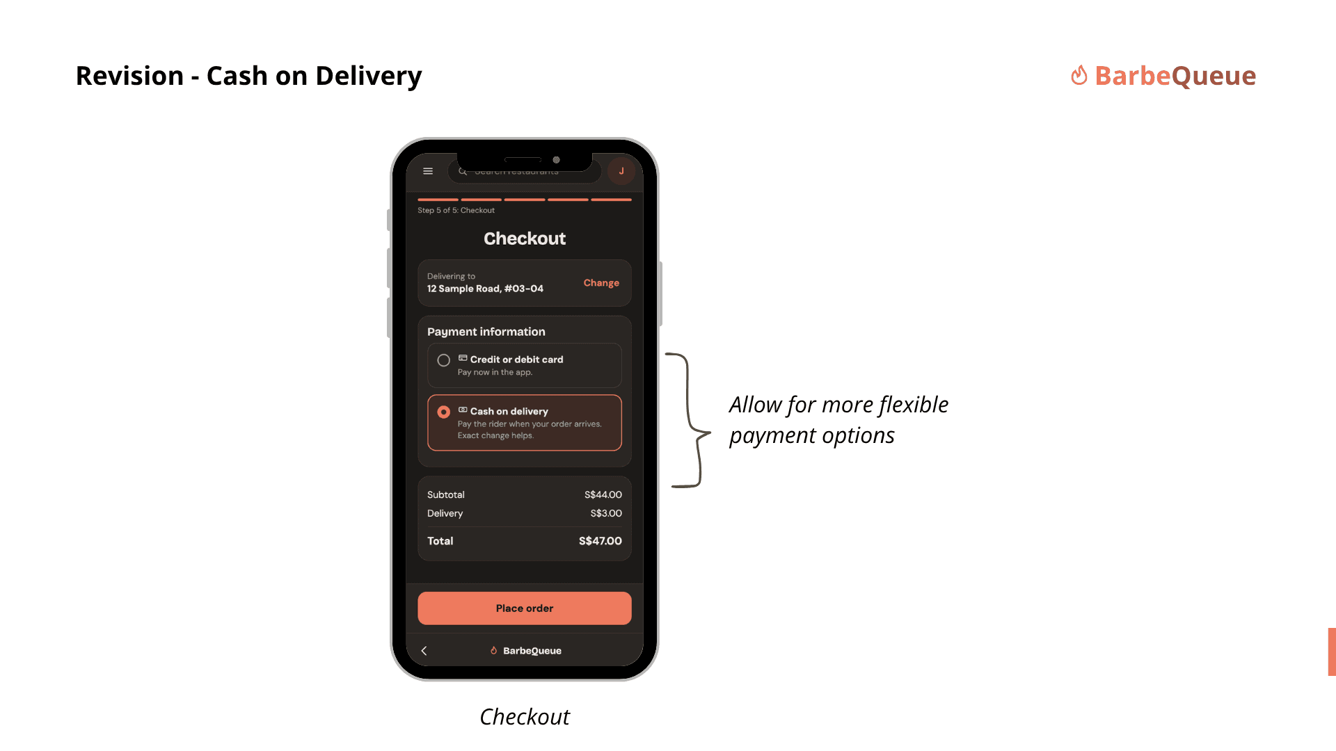
Feature 03
Adding cash on delivery gave customers another way to complete their order without assuming an online payment method.
05. Outcome & Reflections
A More Flexible Ordering Experience.
The revised concept responded to the usability feedback by addressing directly the insights pulled from the usability studies. It featured a saved restaurant feature, customisable shopping cart and facilitated for different payment methods.
While the project concluded after one round of revisions only, it was nevertheless still important in imparting the values of a good research approach.
What I Took Away.
This project was my first experience taking a mobile app concept through research, prototyping, usability testing, and design iteration. It showed me how a confusing label, a hard-to-find action, and the absence of a cart could all point to one larger issue: the app was simply not following the unspoken order that people had expected. As such, it only goes to show how a good user experience is more than just the visuals; it is also all about understanding the demographic that it strives to serve.